Quick Tip - Fixing Vertical Scrolling Bugs
With the introduction of scrolling effects, Muse users are focusing more heavily on creating long, single page websites that use anchor tags for navigation. Clicking an anchor will automatically scroll the page down to a defined content area. This is a great feature to use on your site, however recently we're seeing an increase in support tickets related to these anchor navigation systems, and specifically sites not staying centered when a user clicks a menu item.
Click here to view an example of the bug using our Milo template
Click a navigation item – the site will float far to the right side. This behavior is frustrating, however it’s easily fixed.

Why is this site sitting so far to the left!
Step 1 – Zoom Out
Zoom out on your site, as far as you can go (50%). We need to inspect the site for elements that are floating outside of the site margins.
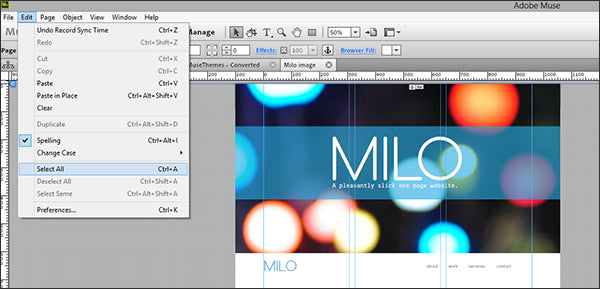
Step 2 – Select All
Click Edit > Select all to select all of the elements in your site. When an element is selected, its container is highlighted and this makes it easier to see empty frames or small elements.

Scroll down through the site, and look for small items that are floating off the far left or right side.
Here’s an example

Step 3 – Delete Stray Elements
It’s easy to accidentally draw a small text box or move an element outside of your site boundaries (and then forget about it). If you come from a print background, you probably use your extra canvas space in Illustrator or InDesign to store unused elements - I sure do! Delete anything that exists outside of the site margins, or simply move the element back inside. 99% of the time this is the culprit that causes layout shifts with long, single page navigation systems.
Always remember to keep your working file tidy, and delete out any empty frames or unused text boxes. Overlapping layers and elements floating away from the site boundaries can cause major headaches when you publish your site.
Good luck!
Cheers,
Steve Harris
Comments
Also, be sure your anchors are vertically aligned or you’ll get the wavy-gravy scrolling on your single page site.
Good tip David. Thanks for the comment!
don’t be a dick, Nathan.
Thank you for this tips. It worked!!!
Thanks for that I was going crazy!! I always had the anchors on the side just out of the canvas, i didnt know that could be a problem :D you saved my day, now it works all fine!
Didn’t work in my case, so I tried with different positions of the anchor. And then, all of a sudden, when I placed it at least 300 Points left outside the site margins, it worked. Don’t ask me why because actually I don’t care :)
Thnx For the tip
Thank you for the tip. I have had the same problem and sliding the anchors out to the left around 300 pixels did the trick. Not sure why it does it but strange anyway.
lol Nathan – says the guy who navigated to this quicktip.
Bug also happens if you group your anchor to a text box.
For people who are new to Adobe Muse and are more familiar with other websites builders this info is still useful. Nathan you shouldn’t be judging even experienced web developers are always learning.

Anyone who hasn’t already figured this out on their own should be paying someone else to do their site. Just saying.